David Wiesner's Best Page Layouts

I first learned of David Wiesner while watching a video about Caldecott winners Wiesner’s book, The Three Pigs, was reviewed. I was intrigued by Wiesner’s use of comic book style panels, and how the pigs “escaped” their story to the space between pages. Similar to breaking the proverbial fourth wall, but in this instance, only within the confines of other storybooks.
I wanted to read more of Wiesner’s work so I reserved all of his books available to me at my local library. Twelve books by Wiesner and two biographies about him. I spent the next few days reading his books multiple times. If you’ve read a Wiesner book, you know how great his art is, and how much fun his stories are to read.
One Sunday morning I dropped my daughter and a friend off to see a movie. During the two hours, while I waited, I spent my time reading and taking notes about Wiesner’s books. It’s the first time in two years I’ve taken notes with a pen and pencil. You can read more about that in Going Back to Paper blog post.
My primary goal in taking notes about Wiesner is to document layout patterns in two of his books: Tuesday, published in 1991, and June 29, 1999, published in 1992. In each book, he repeats a limited set of layouts creating a unique pattern of panels to tell each story.
Tuesday
The children’s book Tuesday won Wiesner a Caldecott in 1992. In this book, Wiesner used one of four layouts for a spread.
Layout 1
The only words that appear in this book are found in one of two similar layouts. The words are on the left page while the right page displays Weisner’s illustrations. The two layouts differ by the number of panels on the right page. This first layout displays three stacked horizontal panels on the right page.

Fig. 1 - Sketch from my notes of a stacked three-panel layout on the right page with words on the left page in David Wiesner’s children’s book, Tuesday.
Layout 2
The next layout you’re exposed to in the story is a full-spread layout.

Fig. 2 - Sketch from my notes of a single panel, full-spread layout of artwork in David Wiesner’s children’s book, Tuesday.
Layout 3
The third layout implores a full-spread, full-bleed panel with three inset panels—two inset panels on the left page and one on the right. Further, in the story Weisner reuses this layout but flips the inset panels to one on the left page and two on the right.

Fig. 3 - Sketch from my notes of a full-bleed layout of artwork with three inset panels in David Wiesner’s children’s book, Tuesday.
Layout 4
The final layout is similar to the first displaying words on the left page. This differs by only using one large panel on the right page.
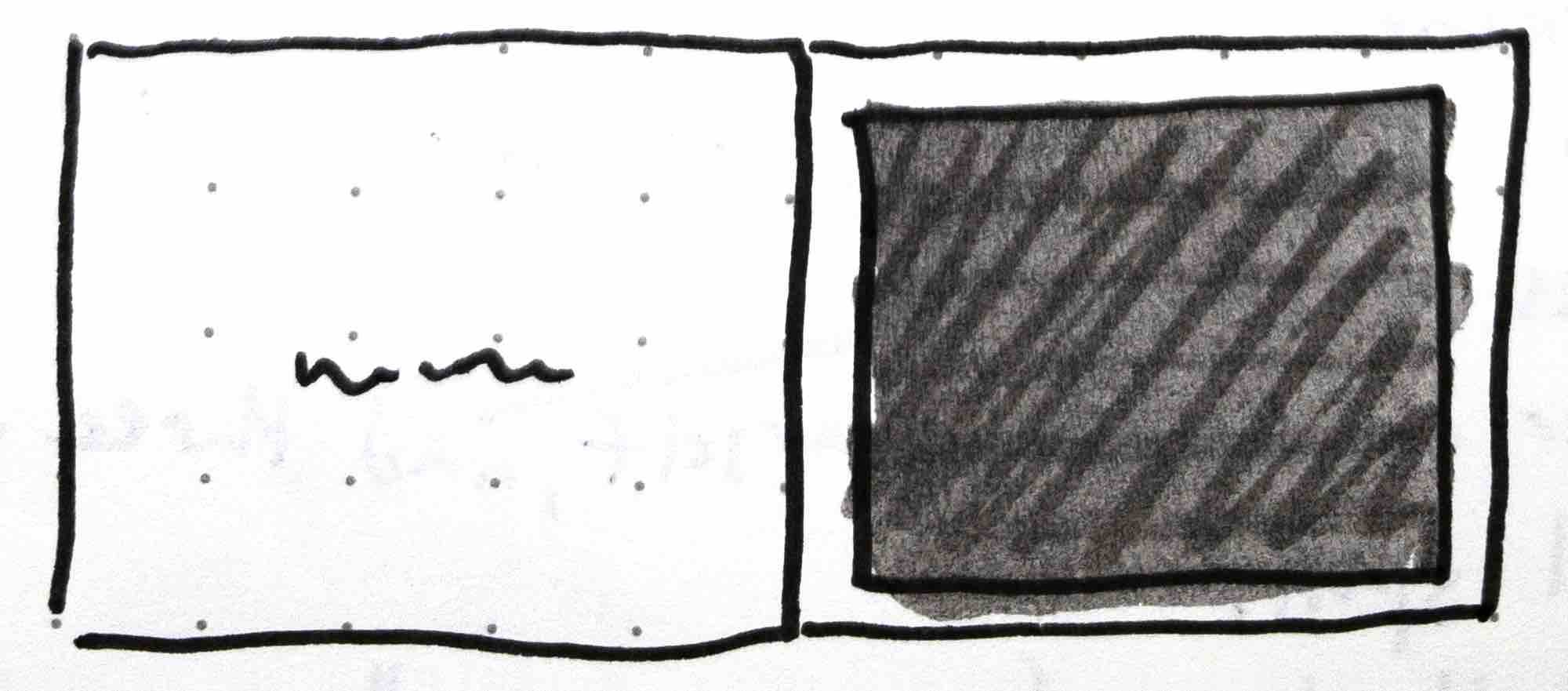
Fig. 4 - Sketch from my notes of a single page panel layout on the right page with words on the left page in David Wiesner’s children’s book, Tuesday.
June 29, 1999
I find this to be one of Weisner’s best-illustrated books. People’s faces are well defined. He is able to effectively show the large scale of the vegetables in relation to the surrounding environments and people.The composition of each spread is very cinematic. Interestingly enough, Weisner only uses three layouts in the entire book.
Layout 1
This layout is his most cinematic in the story. There’s one single panel that stretches across both pages covering about 5/6 of the spread. The words are on the far left of the spread in a single, slim column.

Fig. 5 - Sketch from my notes of a single panel layout with words on the far left in David Wiesner’s children’s book, June 29, 1999.
Layout 2
This is my favorite layout of all of Weisner’s books. Four equal-sized vertical panels with words underneath each are evenly spaced across the spread.
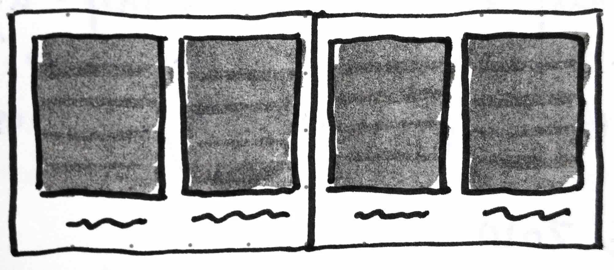
Fig. 6 - Sketch from my notes of a four panel layout with words under each panel in David Wiesner’s children’s book, June 29, 1999.
Layout 3
The very last page of June 29, 1999 provides the third and final layout—one large panel effectively concluding the story. There are no words on this page as the character’s surprised expressions are all that is needed.

Fig. 7 - Sketch from my notes of a single panel layout on the left at the end of the story in David Wiesner’s children’s book, June 29, 1999.
More on Weisner
To date, these two books are Weisner’s very best work in regards to using comic book style layouts and panels to aid his storytelling. As a cartoonist, I think about stories in panels so his approach really resonated with me. It’s given me the confidence to pursue this type of layout and story telling in my books.